Moviestar2019 (talk | contribs) No edit summary |
Moviestar2019 (talk | contribs) No edit summary |
||
| Line 295: | Line 295: | ||
Wb vitaphone logo 1931.jpg |
Wb vitaphone logo 1931.jpg |
||
WB Logo 1923 logo.jpg |
WB Logo 1923 logo.jpg |
||
| + | Wb The Young Philadelphians variant 1959.png |
||
</gallery> |
</gallery> |
||
==Trivia== |
==Trivia== |
||
Revision as of 03:49, 14 December 2019
|
|
The Warner Bros. logo is the production logo appearing at the beginning of films released by Warner Bros. and their various production divisions.
Overview
The logo contains a gold-outlined blue shield with the letters "WB" inside, surrounded by a gold banner reading "Warner Bros. Pictures", and set against a backdrop of clouds.
Logos
Main
| Picture | Description |
|---|---|
| Warner Brothers (1923-1925) | |
 |
|
| Warner Brothers Pictures (1925–1929) | |
|
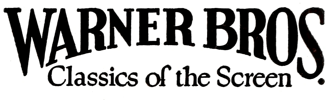
On a black background, a large, bizarrely shaped shield is seen, with a very wide top. The top part of the shield shows a picture of the Warner Brothers studio in Burbank CA, the bottom having a squashed, stylized "WB". "A WARNER BROTHERS" is above the shield (with "WARNER BROTHERS" in an arc around the shield, ala the first Columbia logo), with "CLASSIC of the SCREEN" below. Starting in 1926 or so, it changed to "PRODUCTION". | |
| Warner Bros. Pictures, Inc. (1929–1936) | |
|
The words "WARNER BROS. PICTURES, Inc." appear, and below that "& THE VITAPHONE CORP." appears in a much smaller font, with the "VITAPHONE" using "electric" style letters. Below that is a very small WB shield (using the stylized WB seen in logo 1), and in script, "Present". Behind it there is the drawing of a flag, "waving" so it looks like it is in three sections. On the first one, "WARNER BROS." appears, followed by the electric-letter "VITAPHONE" logo and on section 3, "PICTURES". | |
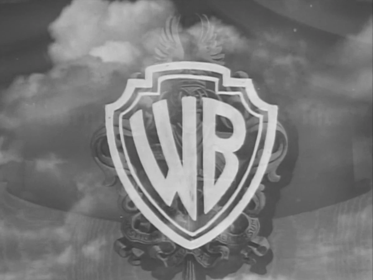
| Warner Bros. Pictures, Inc. (1935–1937) | |
|
Over a cumulonimbus cloud setting, a superimposed WB Shield design zooms in to the screen. The words "WARNER BROS. PICTURES, Inc. Present" appear over the shield. For the prototype version, the shield is shaped extremely bizarrely. | |
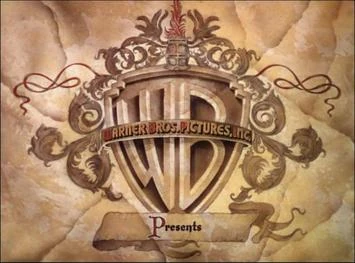
| Warner Bros. Pictures, Inc. (1937–1948) | |
|
Inside a shield, a more realistic version of the stylized "WB" as seen in the previous logo appears. Over the shield is a banner that reads "WARNER BROS. PICTURES, INC." Below the logo is the word "Presents" in script. | |
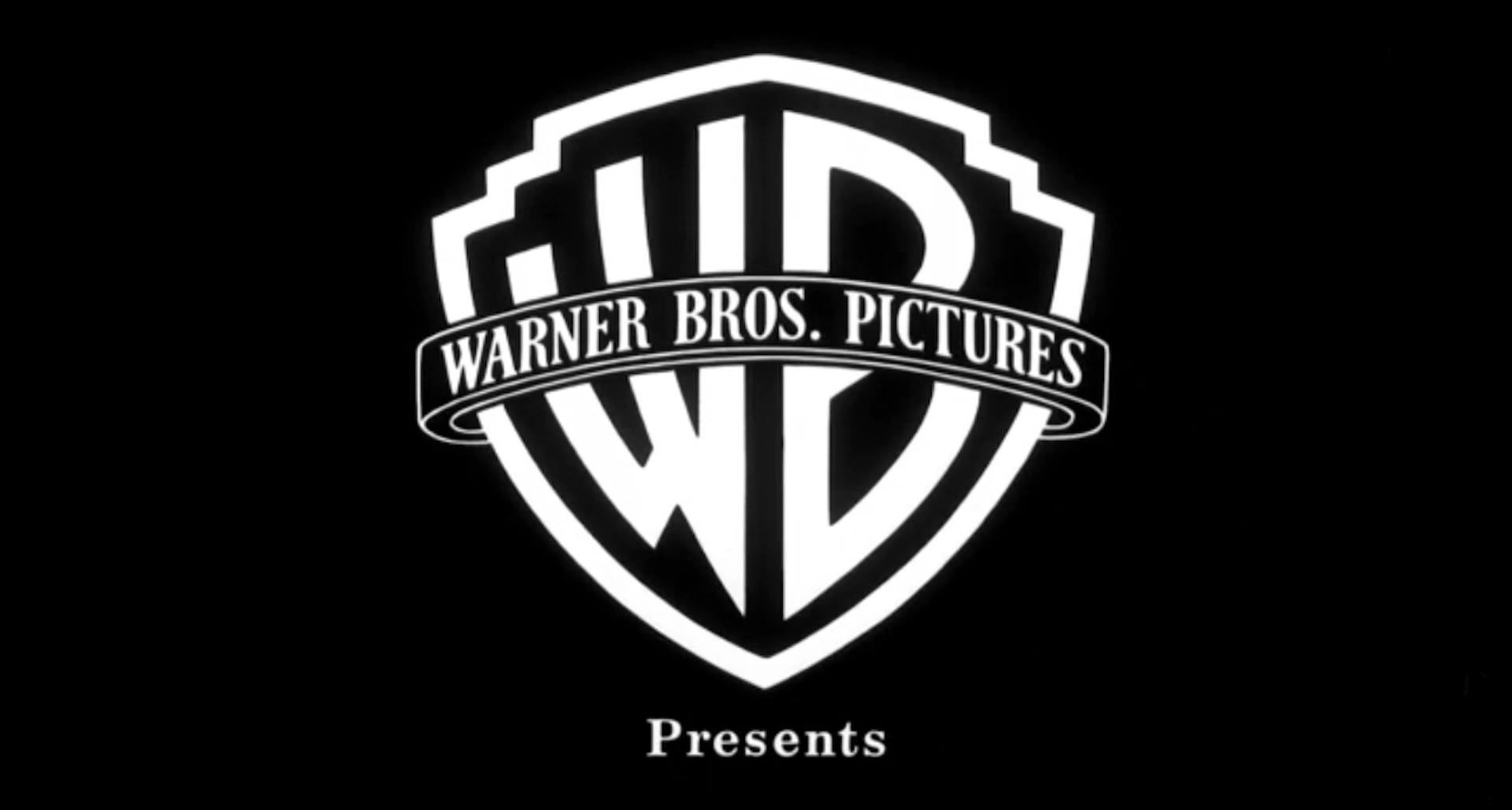
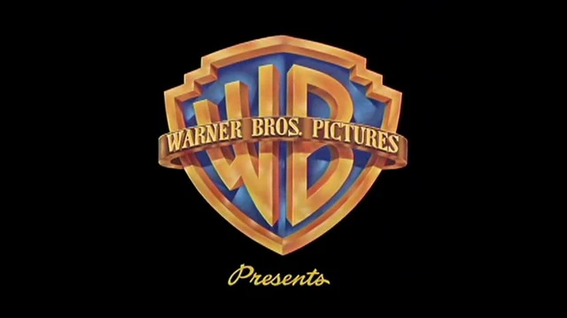
| Warner Bros. Pictures, Inc. (1948–1967) | |
|
Same as the previous logo, only the design has been cleaned up a bit. The border of the shield, banner, text, and "WB" are now colored gold, and the inside of the shield is now blue. The banner phrase is now changed to "WARNER BROS. PICTURES" and is now gold. "Presents", in the same font as the previous logo, usually appears below. Also, the background is now a cloud skyline. For the later years, this logo was usually superimposed onto the titles of Warner features of this period. | |
|
On 3D films and some 2D films that were originally planned to be made in 3D, the WB shield looks more three-dimensional. It was also used for logo plastering on older films for re-releases. | |
| Warner Bros.-Seven Arts (1967–1970) | |
|
Just a superimposed, stylized shield which can be white, yellow or red. The shield features a combination of a "W" and a "7", representing Warner Bros.-Seven Arts. The "W7" is often drawn on-screen, a la the NBC Snake, although it's a still logo on a few films. Below the shield, "WARNER BROS.-SEVEN ARTS" is seen. The word "Presents" usually appears under the shield. | |
| Warner Bros., Inc. A Kinney National Company (1970–1972) | |
|
Over a blue screen is an abstract shield in a golden color with a dark brownish color inside. A simple lettering of the WB appears at the upper part and a rectangle of the same colors appear at the lower part of the shield, with the Kinney byline inside. The word "PRESENTS" appears underneath the logo. | |
| Warner Bros. (1972–1973) | |
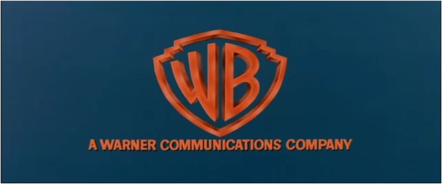 |
Just the standard gold WB shield logo but without the banner, posed on a blue background with "A WARNER COMMUNICATIONS COMPANY" underneath. "Presents", in script, may appear below. |
| Warner Bros. (1973–1984) | |
  |
Aganist a black background, a red abstract "W" consisting of two slanted elongated circles and a shorter elongated circle zooms in towards us. Around halfway through, the words "WARNER BROS" (in the Warner Communications custom typeface) appear below it. The red logo overtakes the screen as a smaller white "W" zooms in. It stops at the middle of the screen and a black square field, whose corners have been rounded and softened, fades in around the logo. "A WARNER COMMUNICATIONS COMPANY" in the same font used for "WARNER BROS" fades in below. Most of the time, "PRESENTS" fades in below after that. |
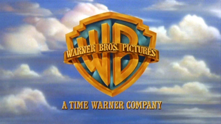
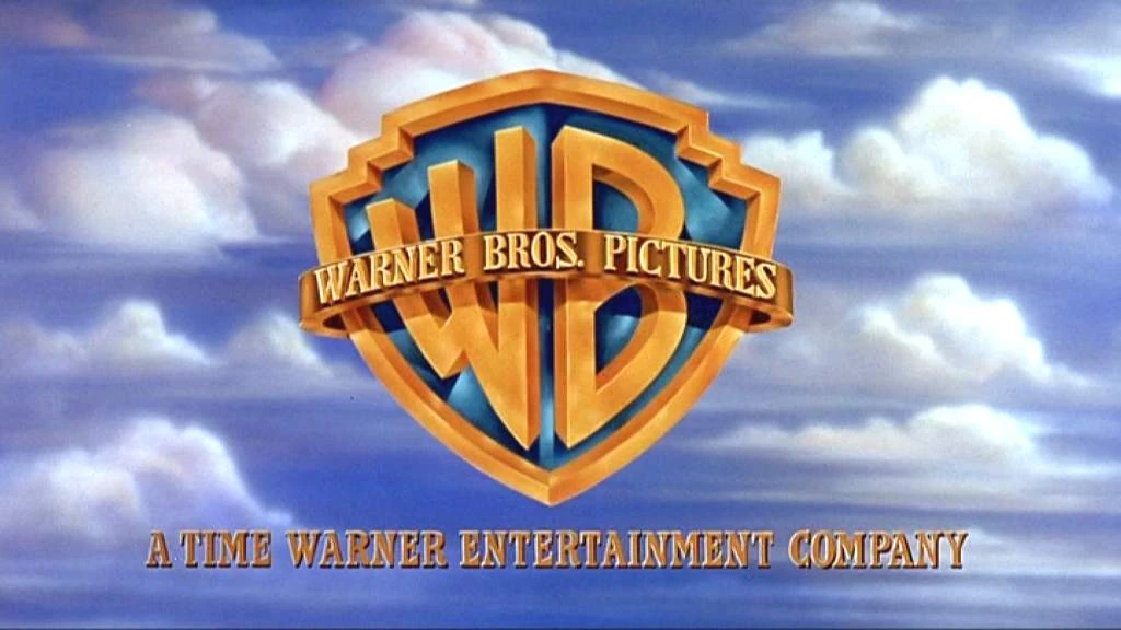
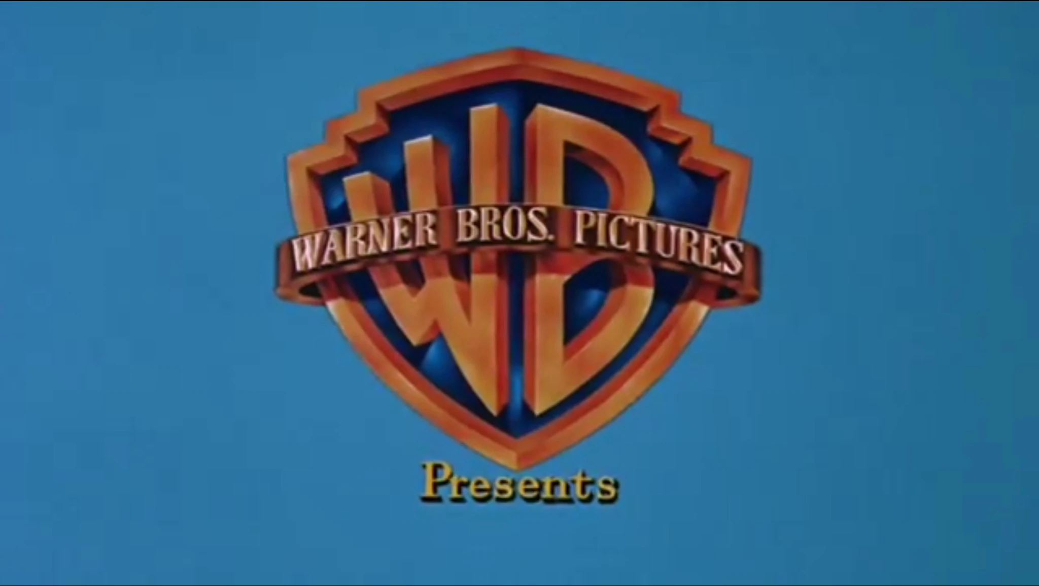
| Warner Bros. Pictures (1984–1998) | |
|
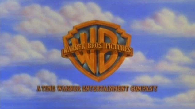
Against the backdrop of clouds is the gold WB shield (both are in their same styles from the 1948 logo) with a gold banner around it with the words "WARNER BROS. PICTURES". Below it is a byline that reads "A WARNER COMMUNICATIONS COMPANY". From 1990 until 1992, the byline reads "A TIME WARNER COMPANY", and from 1992 until 1998, the byline reads "A TIME WARNER ENTERTAINMENT COMPANY". On scope films, the backdrop of clouds is entirely different. | |
 | |
 | |
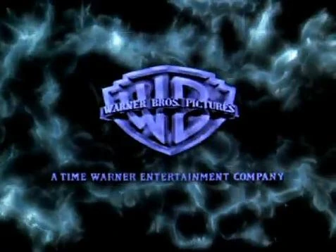
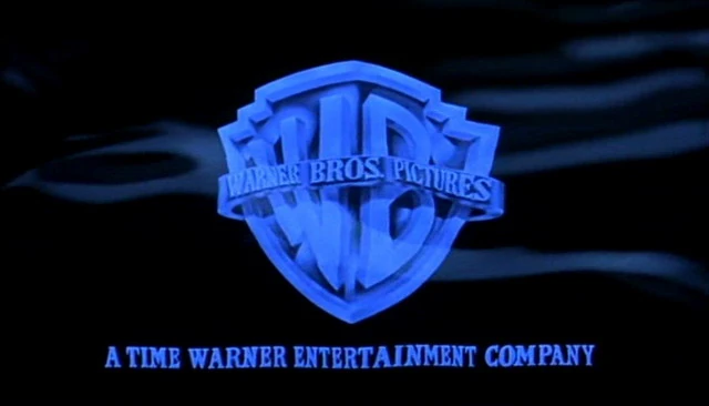
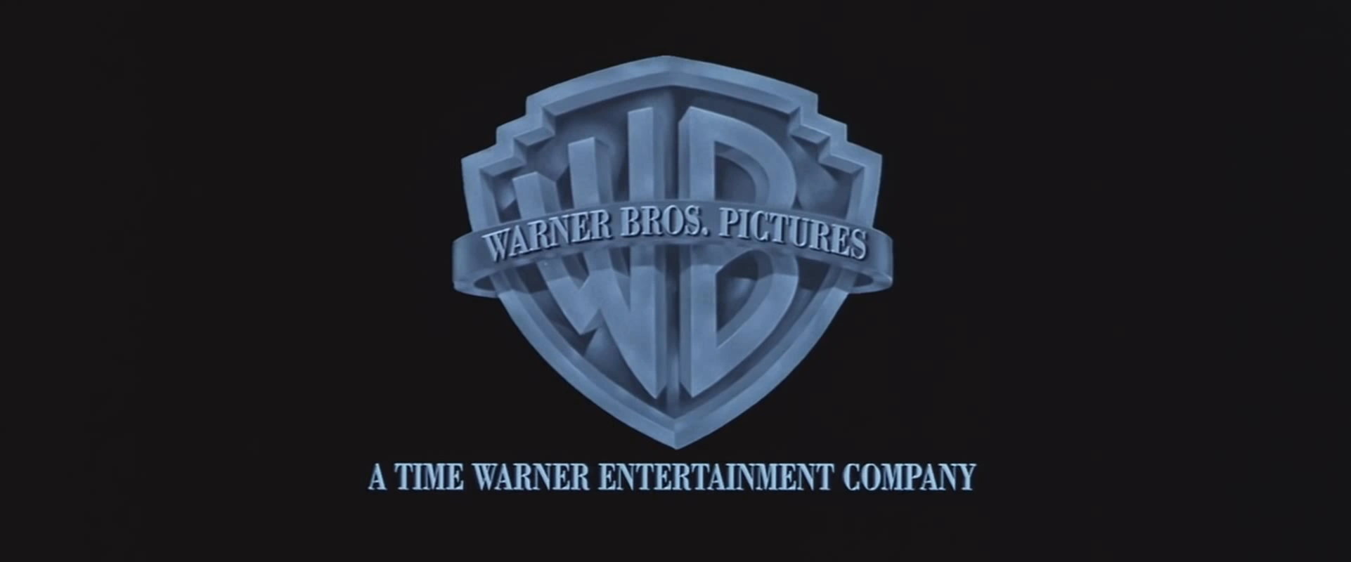
| Warner Bros. Pictures (1998–2019) | |
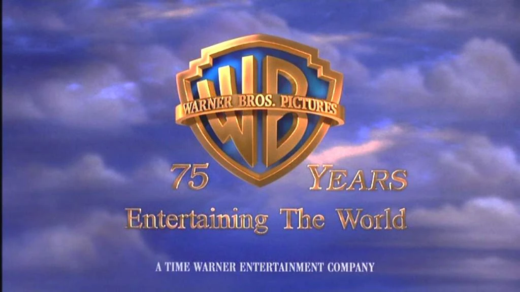 |
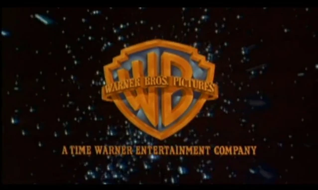
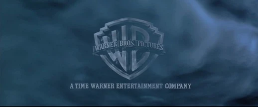
A image of the Warner Bros. studios is seen in gold tint where it "ripples" before revealing to be reflected on the side of the shield as it zooms out against the same sky of clouds. "A TIME WARNER ENTERTAINMENT COMPANY" fades in underneath. This logo was animated by Intralink Film Graphic Design. For the logo's first year, to celebrate 75 years of Warner Bros., the shield zooms out to a more further position, "75" and "YEARS" appear from behind the shield and move away to surround it. "Entertaining The World" fades in underneath followed by the Time Warner Entertainment byline in white and in a different typeface. Also, the background is slightly enhanced, and the shield has a slightly different lighting. There is also a rare variant for this logo's first year, where the banner only reads "WARNER BROS." instead of "WARNER BROS. PICTURES". From 2001 to 2003, the byline changed to "An AOL Time Warner Company". Then from 2003 until 2018, it was changed to "A TimeWarner Company" (though for a short time in 2003 until early 2004, it had the prototype byline) and from 2018, it has "A WarnerMedia Company". Starting with Dolphin Tale, the logo was redone with the shield being sleeker, the banner being shinier, the byline being changed from gold to orange-yellow, and the animation of the shield being revealed is enhanced. |
Closing
Variations
Movies
| Picture | Description |
|---|---|
| (1935–1937) | |
 |
|
| (1937–1948) | |
 The Private Lives of Elizabeth and Essex (1939) |
|
| (1948–1967) | |
 The Young Philadelphians (1959) |
|
 |
|
 |
|
 |
|
 |
|
| (1984–1998) | |
 |
|
 |
|
 | |
 |
|
 |
|
 |
|
 |
|
Shorts
Warner Bros. Family Entertainment
| Picture | Description |
|---|---|
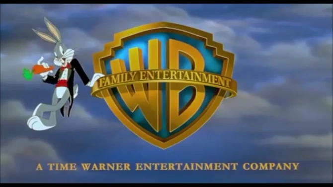
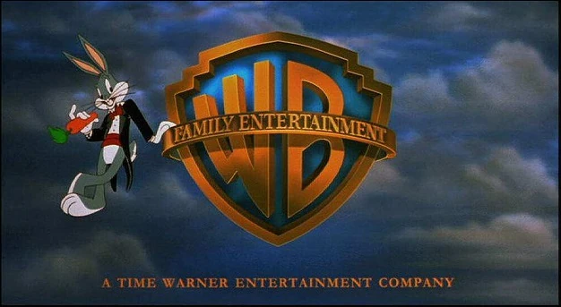
| (1992-2001) | |
|
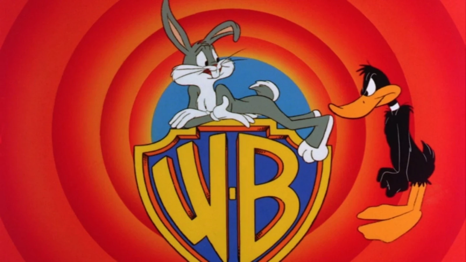
Against the classic backdrop of clouds, the WB shield is posed with the banner reading "FAMILY ENTERTAINMENT". The byline "A TIME WARNER ENTERTAINMENT COMPANY" fades in under the logo and Bugs Bunny dressed in a tuxedo steps to the left from under the shield, does a Vanna White-like pose, and puts his hand on the banner as he leans, brandishes a carrot and takes a bite on it as the banner shines. | |
| (1998-2009) | |
|
Nearly the same as the 1998 Warner Bros. Pictures logo, the only differences are that the shield banner reads "FAMILY ENTERTAINMENT" instead of "WARNER BROS. PICTURES", and Bugs steps to the left from under the shield, doing the same pose and animation from the previous logo. The byline fades in below. During Warner Bros.' 75th Anniversary, the logo uses the "75 YEARS" variant from the Warner Bros. Pictures logo, but the differences are the background being darker, the shield along with the text is darkened to a brown-gold color and the animation of Bugs Bunny is added. This was only seen on Quest for Camelot, A Rat's Tale, Dennis the Menace Strikes Again! and the trailer for The King and I. Until 2001, "A TIME WARNER ENTERTAINMENT COMPANY" byline is used before it is replaced by "An AOL Time Warner Company" and then in 2004 "A Time Warner Company". Other times from 2003 until 2008, the logo is byline-less. | |
 | |
 | |
Warner Bros. Animation
Warner Bros. Feature Animation
| Picture | Description |
|---|---|
| (1999) | |
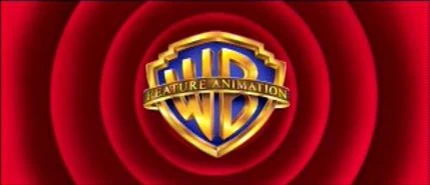 |
The WB shield without the banner zooms through the red Looney Tunes rings as the banner fades in over the shield reading "FEATURE ANIMATION". The shield then stops in its place as "A TIME WARNER ENTERTAINMENT COMPANY" byline fades in, then the rings fade out one-by-one when the WB shield turns dark and fade out. On the pan-and-scan version of the film, the logo has an open-matte version. On a crew reel as well as the Brad Bird voice over on a trailer, a prototype version of the logo is used. This was only seen on The Iron Giant since the film was originally going to use the Family Entertainment logo, but director Brad Bird was against this, and the custom variant of the logo was used in the film. |
Warner Animation Group
Kids' WB
Warner Sogefilms
Warner Bros. Television
Shorts
Video games
Warner Bros. Interactive Entertainment
WB Games
Warner Bros. Home Entertainment
Appearances in various productions
Openings from Films
Gallery
")
")
.png "DISTRIBUTED BY WARNER BROS. (1992).png (1.05 MB)")
")
")
")
.png "DISTRIBUTED BY WARNER BROS. (1990).png (603 KB)")
")
")
")
")
")
")
")
")
")
")
")
")
")
")
")
")
.png "Warner Bros. 2019 (with wordmark).png (23 KB)")
")
.png "Warner Bros. 2019 (alt).png (45 KB)")
")
")
")
")
")